Annie Sloan’s 2024 Colour Predictions
As we step into 2024, we asked our founder, Chalk Paint inventor and CBE Annie Sloan, which colours are trending for the year ahead. Annie walked us through a spectrum of shades, with one important rule: breaking free from traditional decorating rules and embracing colour personalities.
Whether pairing Olive Green with natural wood tones or balancing rich terracotta Paprika Red with neutral greys, the emphasis is on celebrating personal style and creating spaces that empower and recharge. The uniting thread running through your interiors is to unapologetically celebrate your unique style in your home, fostering living spaces that reflect and enhance your individuality leaving you feeling creatively charged. Match moods to spaces; make kitchens dynamic with bright cheerful colour and bedrooms seductive with moodier palettes.
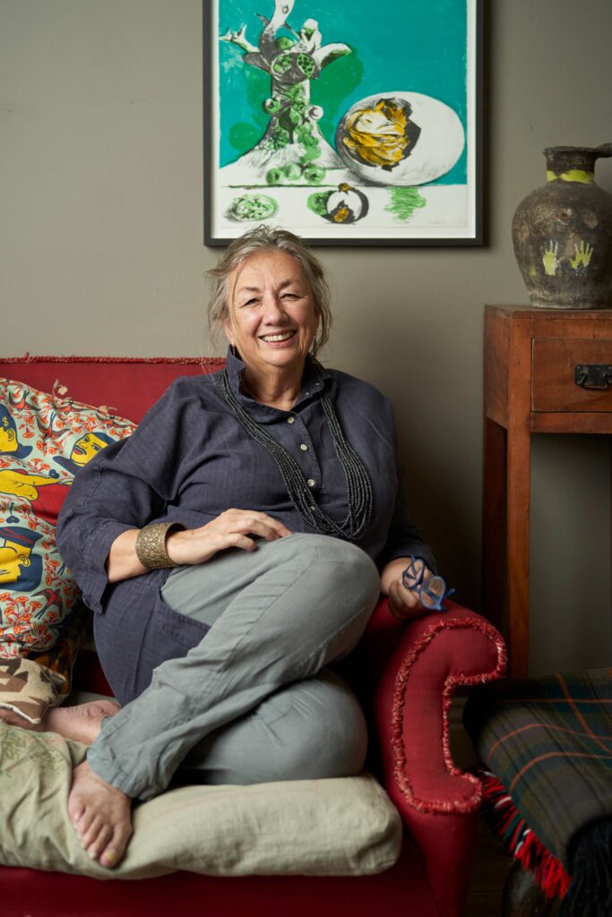
Now read on for Annie’s best interior colour palette picks for 2024!
In 2024, I predict a beautiful, harmonising interplay between colours that will resonate with the current mood for empowerment, self-expression and sustainability.
- Earthy, rich Olive Green will dominate, bringing nature’s serenity into living rooms and bedrooms, creating tranquil sanctuaries. This darker-than-sage but lighter than forest green has the reassuring softness of the former and the introspective romance of the latter. It’s important that this green has some red pigment in it to keep it the warm side of sophisticated rather than flat and stagnant.
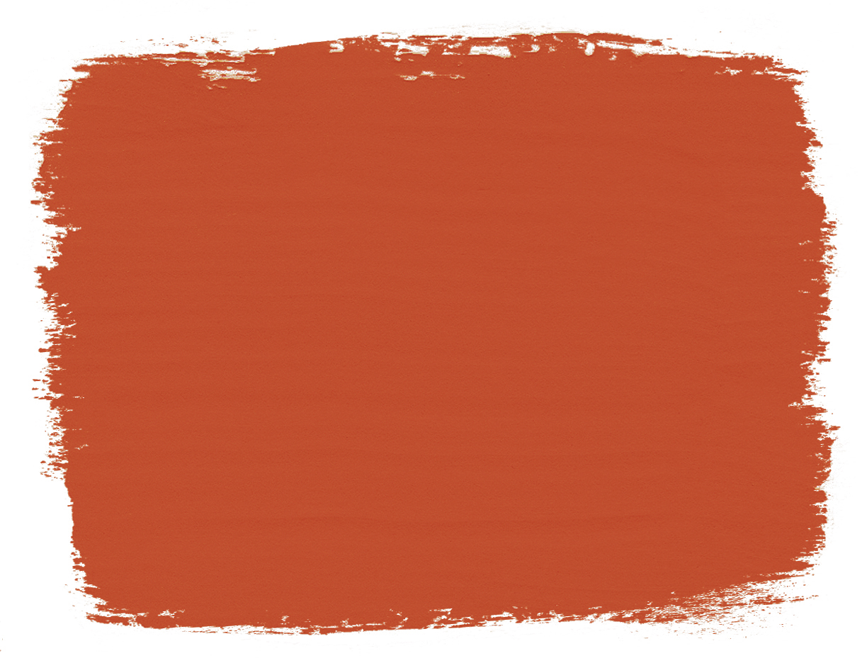
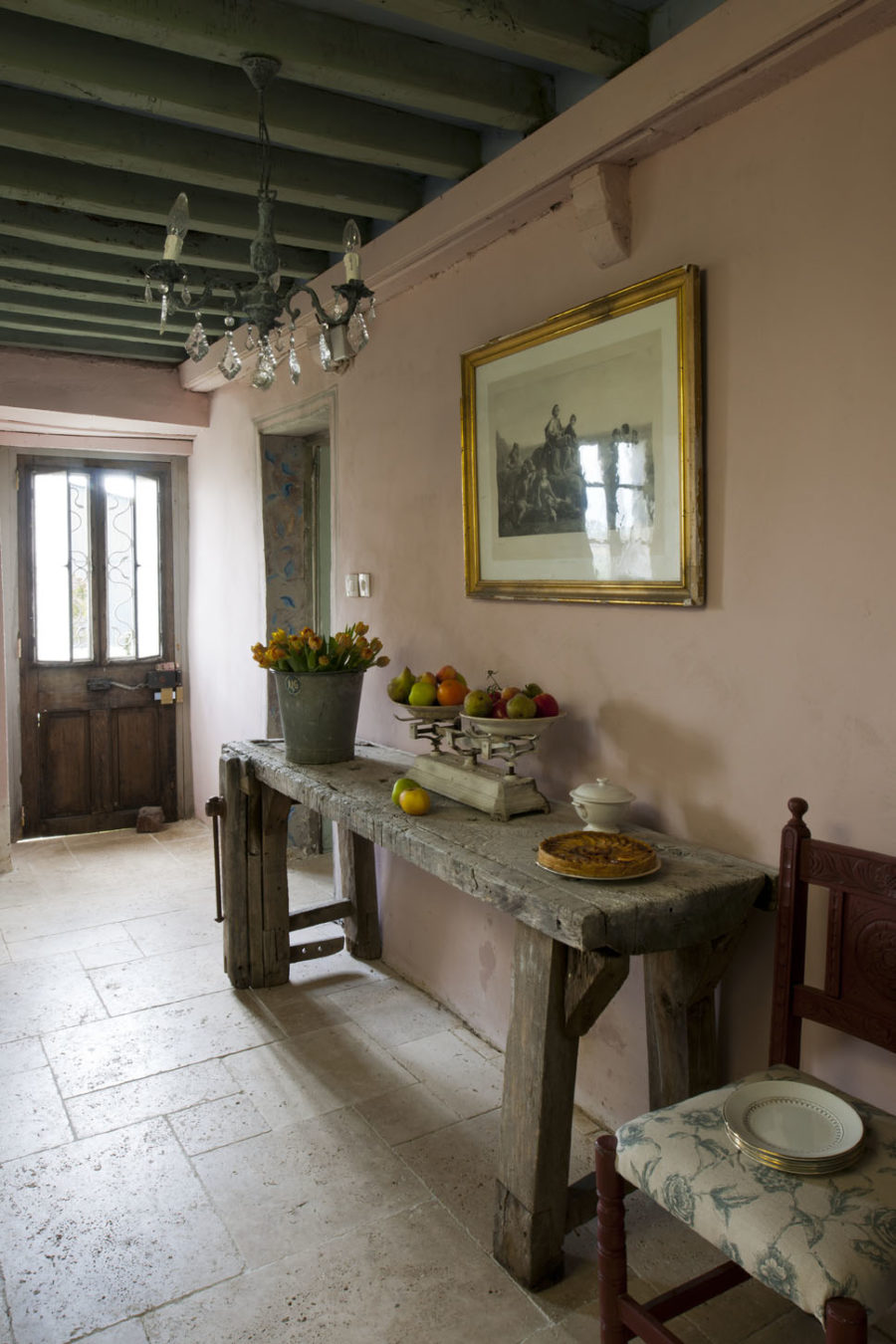
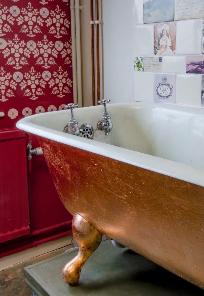
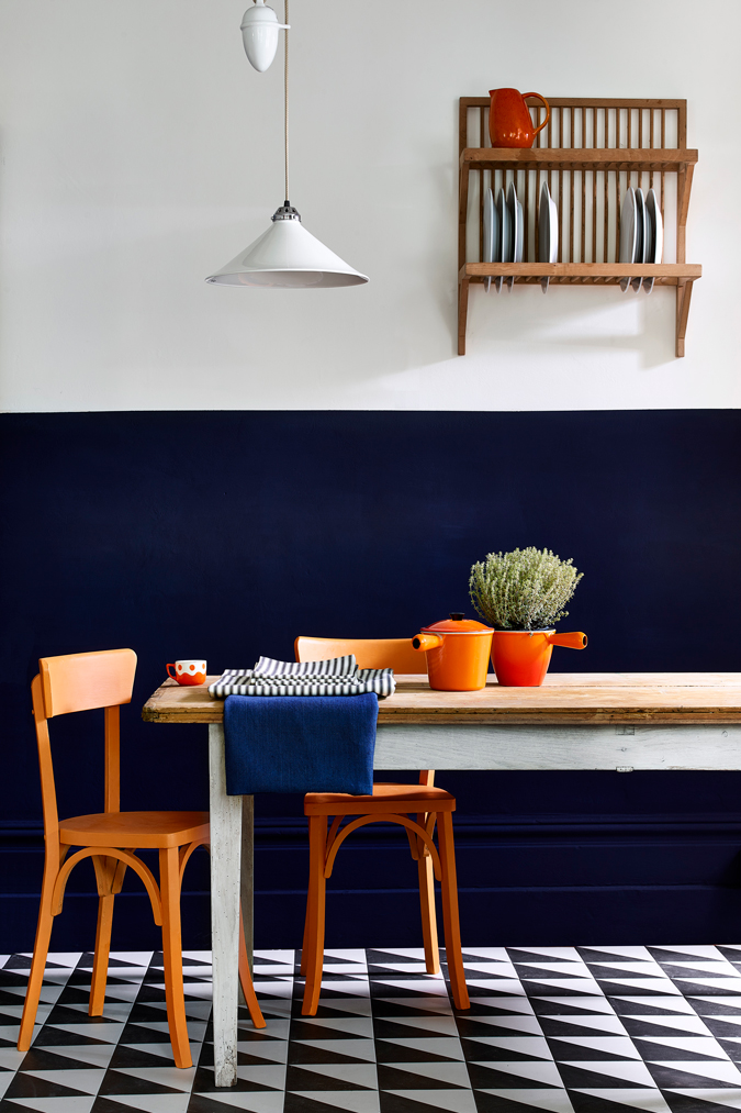
- Warming terracotta, like the new Chalk Paint colour Paprika Red or Riad Terracotta in Annie Sloan Wall Paint, will infuse energy into kitchens and dining spaces, igniting creativity and warmth. This colour was perhaps overused in the early 00s and suffered with a bad reputation, but as far as being a colour that can inject some excitement, positivity and pizzazz into a space quickly goes it doesn’t have much competition. I love it on walls in dynamic spaces where we cook or eat to celebrate food, as these places are welcoming of colour and this shade will spark dinner party conversation! Since it’s such a strong shade however, it can also be used lightly on furniture and fittings to add layers and excitement and confidence into a space. I also used my Wall Paint in Riad Terracotta in a bathroom recently, to reference Morroco’s Hamman spas, and it contrasted delightfully with traditional white Victorian fixtures and fittings. Elegant and unexpected.
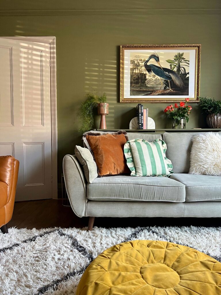
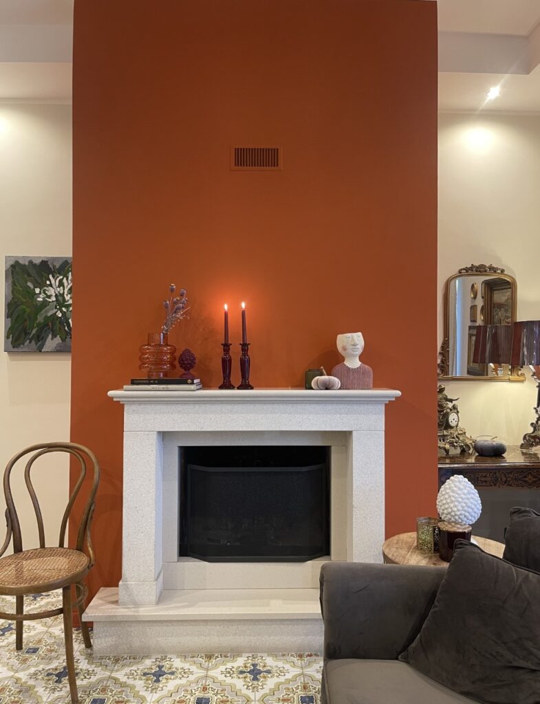
Pictured: Olive Green wall paint and Riad Terracota wall paint.
- Luxuriously beige Old Ochre ( available in both Chalk Paint and Annie Sloan Wall Paint formulas) remains a timeless choice for creating cosy and inviting atmospheres. Beige is big on Instagram and although I could never recommend a monochrome space (please, at the very least contrast it with Athenian Black! Or better yet, a cobalt blue to emphasise the nude warmth of this minky buff) this is a really contemporary neutral with a velvety finish that will set off the indulgent feelings the colour invokes. Think of Sofia Richie and athleisure; this is understated luxury in a tin.
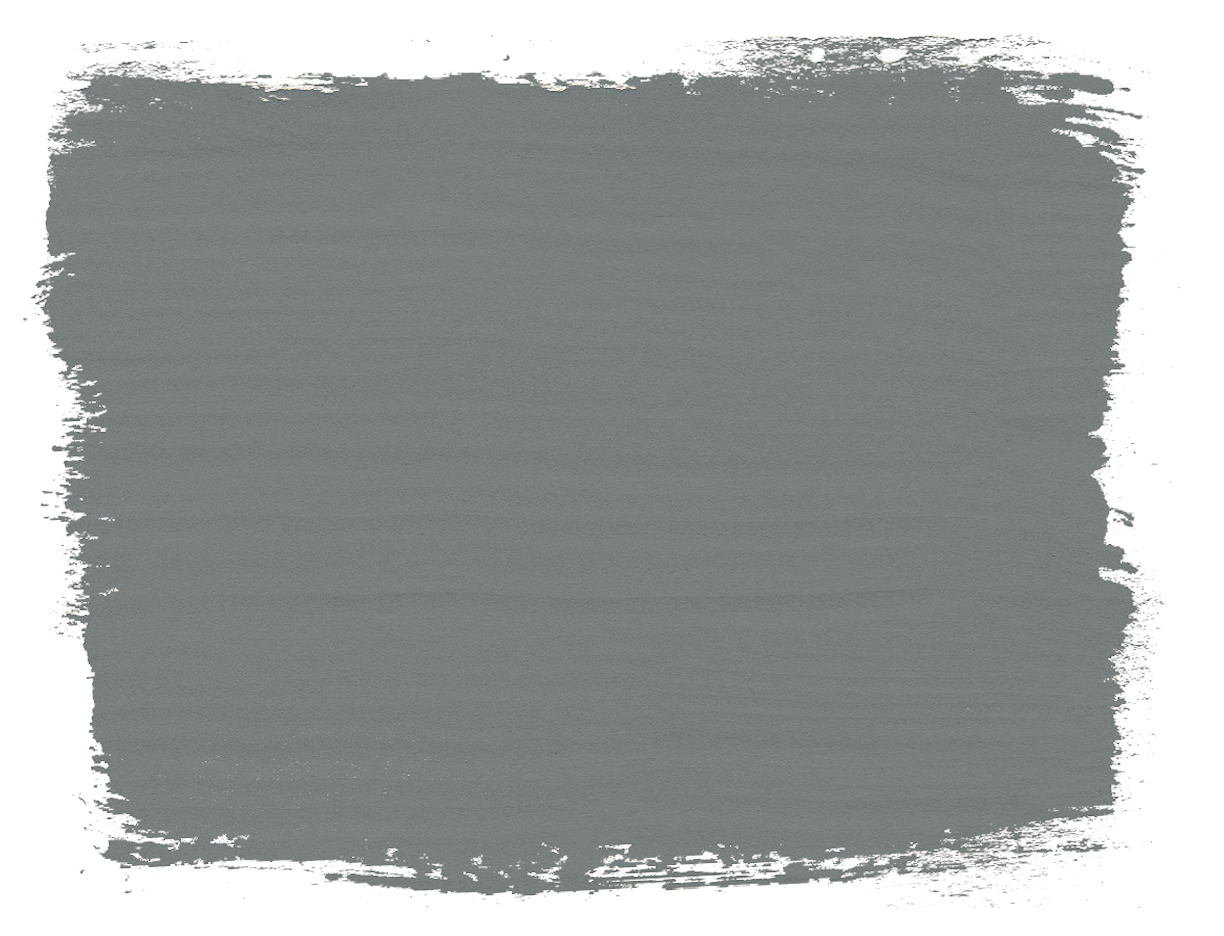
- Steely blue Cambrian Blue (found in Annie Sloan Wall Paint and the one-step Annie Sloan Satin Paint) will evoke a sense of grown-up sophistication, making it ideal for home offices. This is a colour that will look fabulous on camera in the background of a Zoom call and command respect as it quietly but confidently announces your excellent taste in colour. Not shouty, but still stand outy. For the same reason it works well on front doors and in hallways. Gives an excellent, intriguing first impression. pictured: Olive Green wall paint and Riad Terracota wall paint.
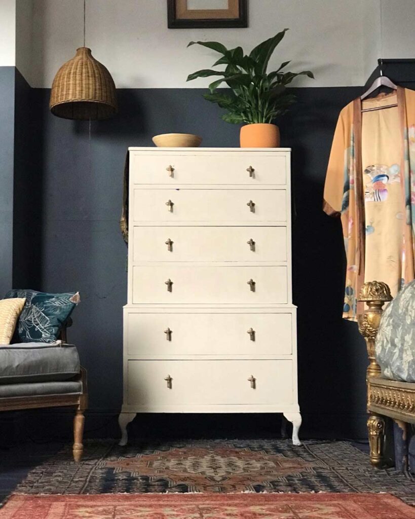
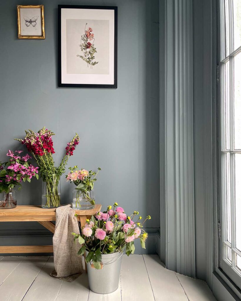
Pictured: Old Ochre chalk paint and Cambrian Blue wall paint.
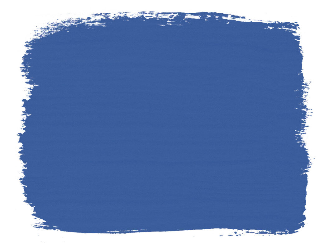
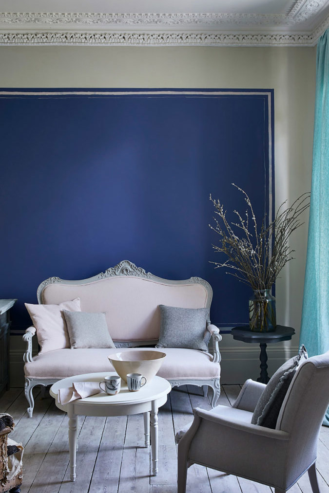
- Frida Blue is my brand new cobalt, formulated to match Frida’s favourite colour: the shade with which she painted her home, Casa Azul in Mexico City. This has immediate Fine Art kudos and will sing on furniture. As we try to move away from buying new and mindless consumerism, make like Frida and repaint furniture to make one off pieces of art (and save furniture from landfill). The joy of creative satisfaction will give you a buzz that lasts much longer than buying new.
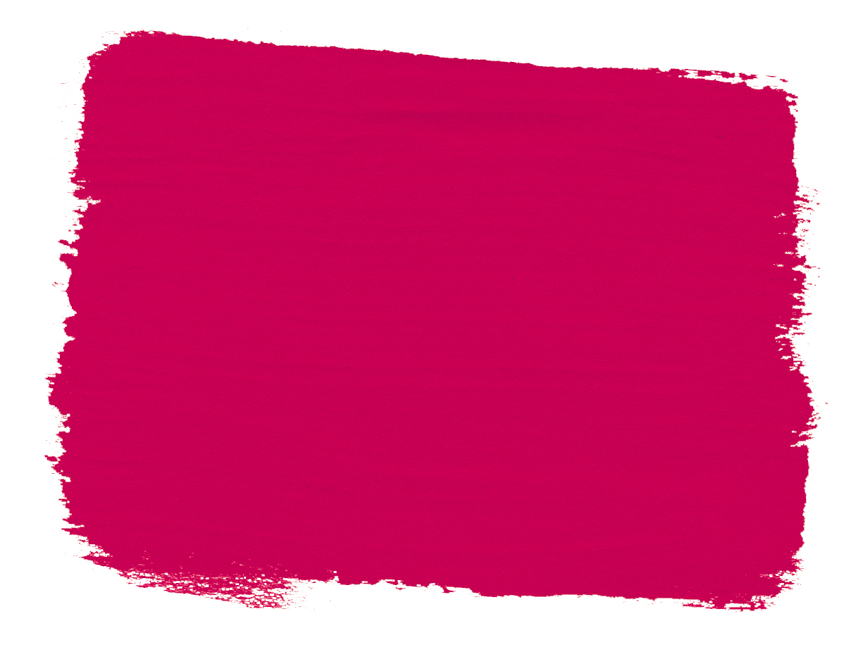
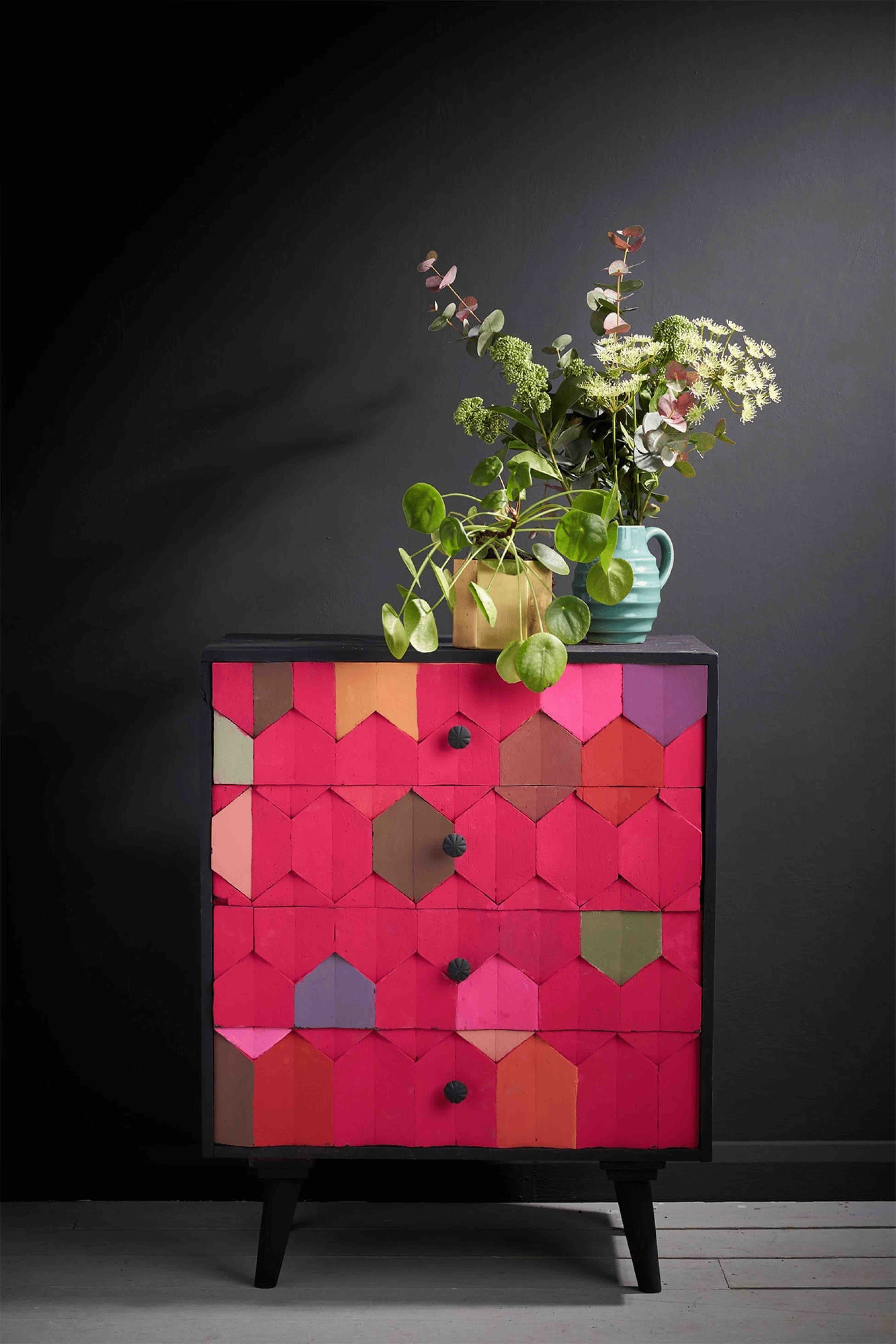
- Lastly, the joyful Capri Pink, inspired by Schiaparelli’s iconic Shocking Pink, will empower spaces, especially for those inspired by the success of this year’s Barbie movie, allowing feminine power to course through your home. This shade is about making a space your own without compromise. Apply it to walls as Annie Sloan Wall Paint for a jaw-dropping Hollywood Regency statement or apply to furniture in a Chalk Paint formula to give a pep in your step whenever it catches your eye. This colour is all about the mood
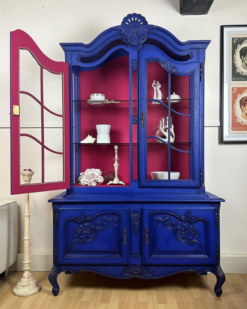
Pictured : Frida Blue and Capri Pink Chalk Paint
When it comes to using these shades in your home, try a different approach to how you build a room. Create colour palettes based on colour personalities rather than strict decorating dos and don’ts:
Pair Olive green with natural wood tones and pops of gold for an organic and regal feel. The mood here is sophisticated but playful, think chopping boards sourced on holiday in Greek islands juxtaposed with modern artworks and bright textiles.
- Balance the warmth of rich, passionate terracotta with neutral greys or subdued greens for a grounded and inviting look.
- Old Ochre will work with virtually anything. For some colour, it can be elegantly complemented by muted pastels like soft blues or pale pinks, creating a classic and serene ambiance. Alternatively, go full bouji: layer with boucle-textiles, minimalist curvy décor, and matt black Athenian Black Chalk Paint on furniture/radiators/home accessories to create tonal contrast yet calming uniformity.
- For Cambrian Blue, combine it with soft pinks and metallic accents to achieve a contemporary and airy atmosphere. This is especially lovely in a bathroom – think gold taps and pillowy Pointe Silk towels.
- Capri Pink invites bold contrasts; pair it with hot red Emperor’s Silk (we did this in a study once!) or navy blues for a sophisticated and empowered vibe. Don’t be afraid to experiment and let your personal style shine through in your colour combinations!
The uniting thread is to discover your personal style and unapologetically celebrate that in your home. This will create living spaces which empower and recharge you.
So which shades are you drawn towards? Will you refresh a whole room with a splash of colour on an old piece of furniture or build a whole new space with our range of Annie Sloan Wall Paints?
featured products

Related Inspiration
Related Inspiration
Use of cookies
AnnieSloan.com uses cookies to improve your experience when you browse the site.
