Why We Love Blue

There is something instinctive about why we love blue. It is associated with peace, trust and stability. Blue is the colour of wide summer skies and deep oceans, of calm mornings and endless horizons. Blue reassures us, grounds us, and invites us to pause. It can be serene and meditative or bold and joyful.
It lowers our heart rate and makes spaces feel more restful. That’s why blues work so beautifully in bedrooms, bathrooms and living spaces – anywhere you want to feel calm and at ease.
From pale, airy sky blues to rich inky navies, blue can be playful, dramatic, nostalgic or modern. It can feel fresh and coastal, elegant and traditional, or bold and contemporary. Blue is a colour that adapts to your personality and your home.
Blue is a colour that works beautifully in almost any room and with almost any interiors style. No wonder it has remained one of the most popular colours in interiors for centuries.
Blue Paint Colours
Over the years we’ve developed a family of blue Chalk Paint™, Wall Paint and Satin Paint colours that reflect just how versatile this colour can be.
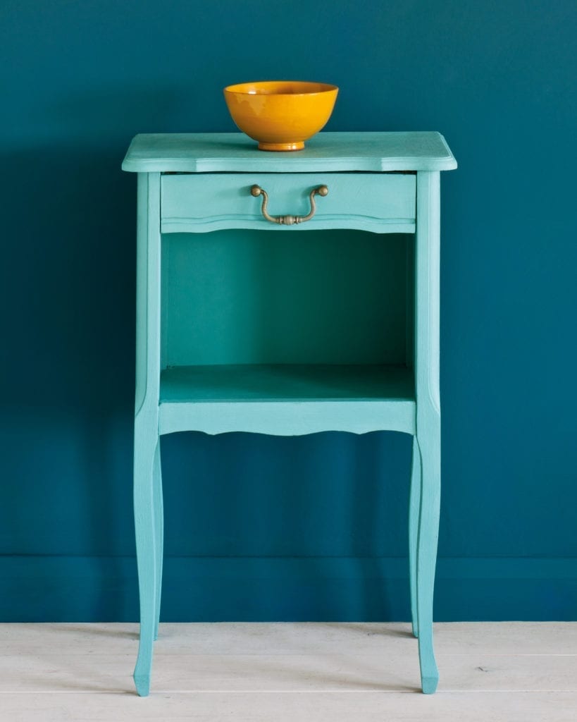
Duck Egg Blue is soft, gentle and endlessly popular. Inspired by Rococo Swedish interiors, it’s a greenish-blue that feels both fresh and nostalgic. It works beautifully in kitchens, bedrooms and on vintage furniture.
Provence is joyful and vibrant, like the shutters of houses in the south of France. It brings energy and warmth to a room and is perfect if you want a blue that feels alive and sunny rather than quiet.
Louis Blue has a refined, elegant quality. Inspired by 18th-century French and Swedish interiors, it is perfect for creating a sophisticated, antique feel.
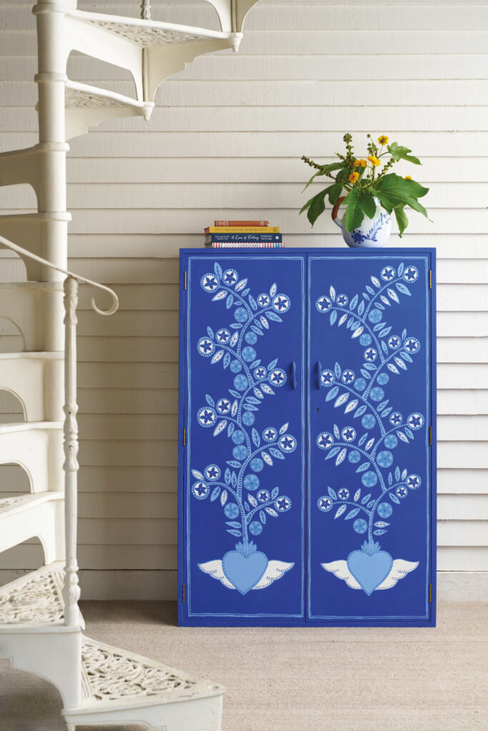
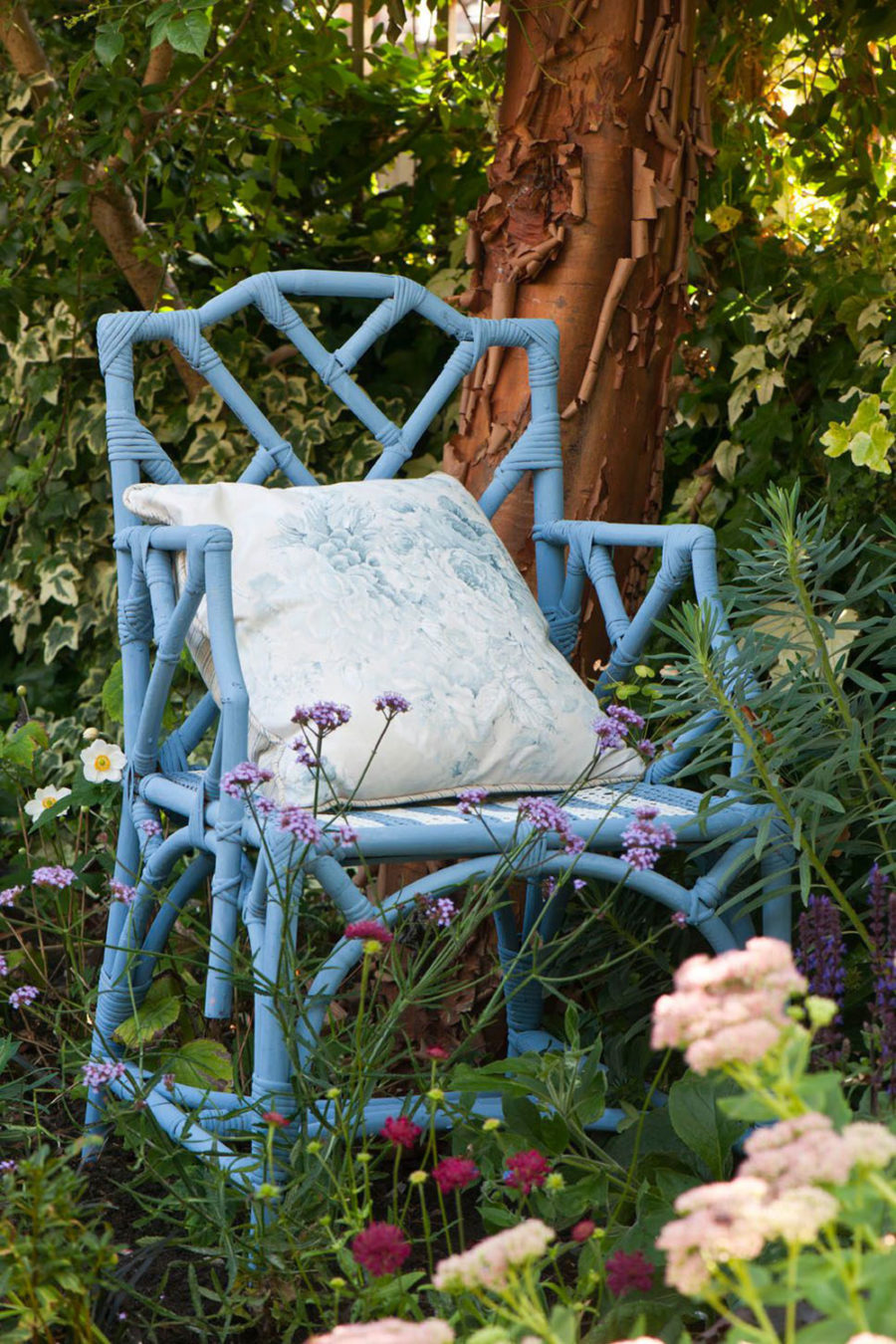
Napoleonic Blue is strong and confident – a deep blue that feels bold without being overpowering. It’s wonderful on statement pieces like dressers, wardrobes or front doors.
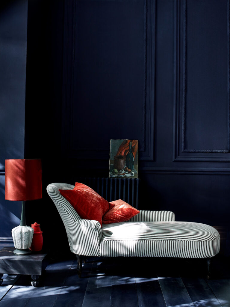
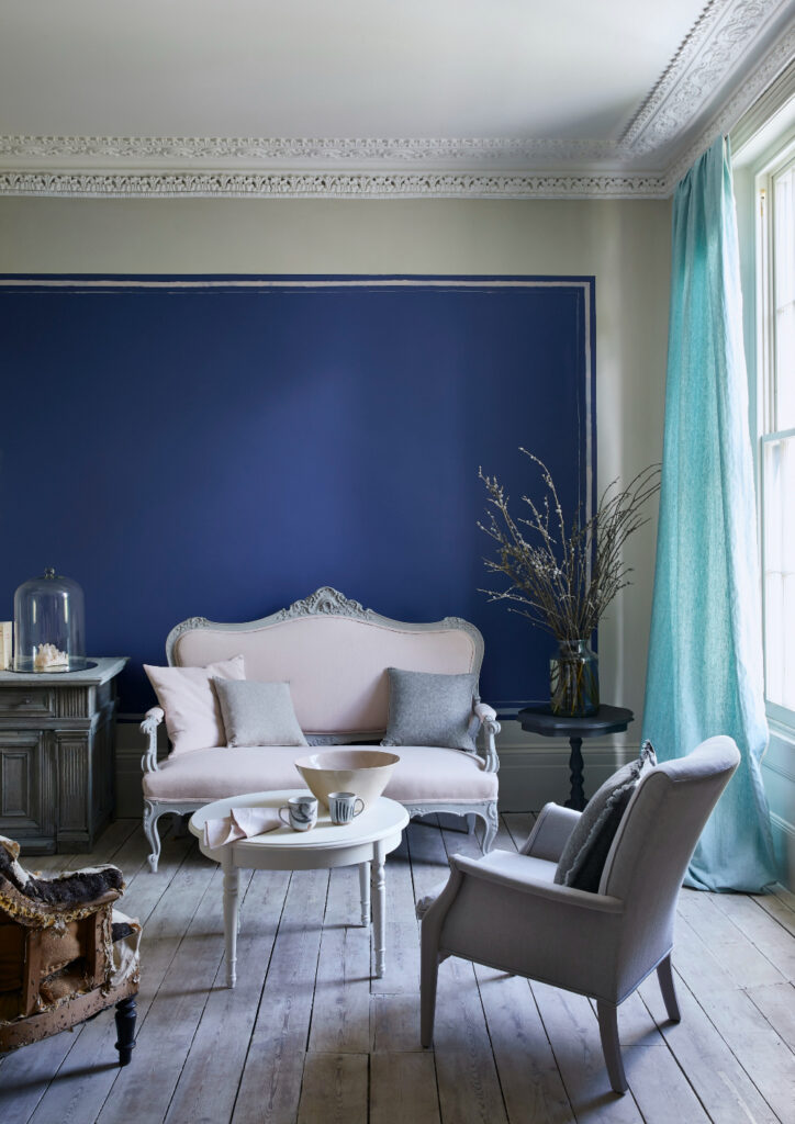
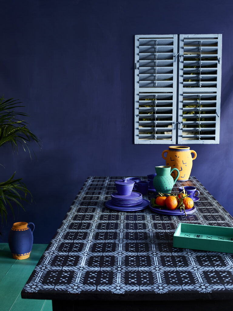
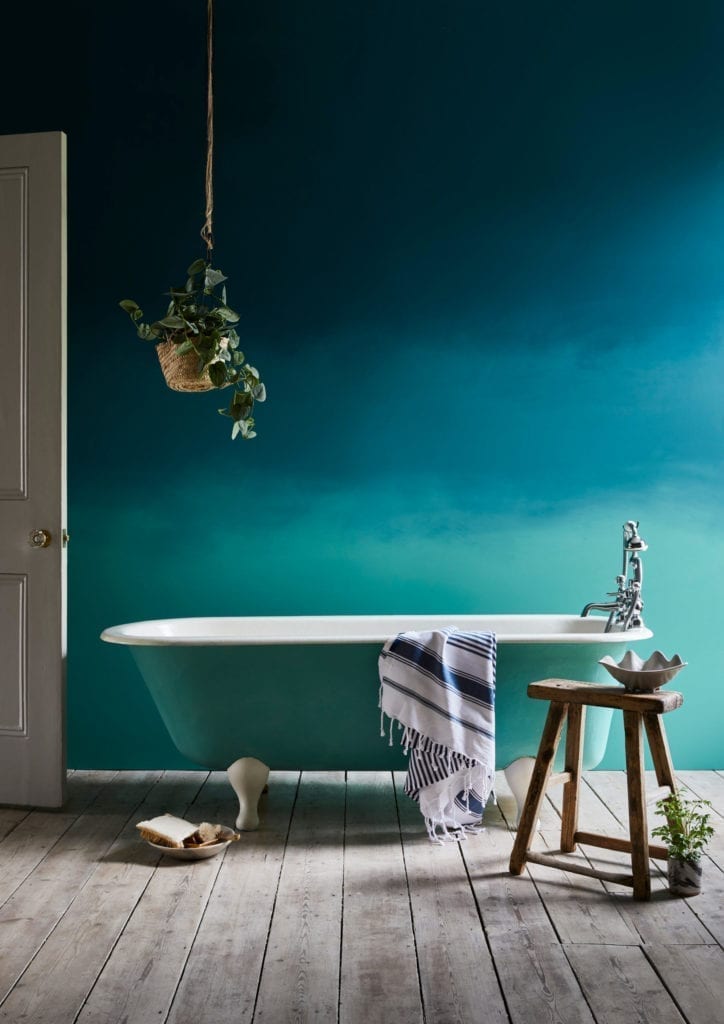
Oxford Navy is rich, dark and dramatic. It has all the depth of a classic navy, perfect for creating moody, elegant interiors and for grounding a colour scheme.
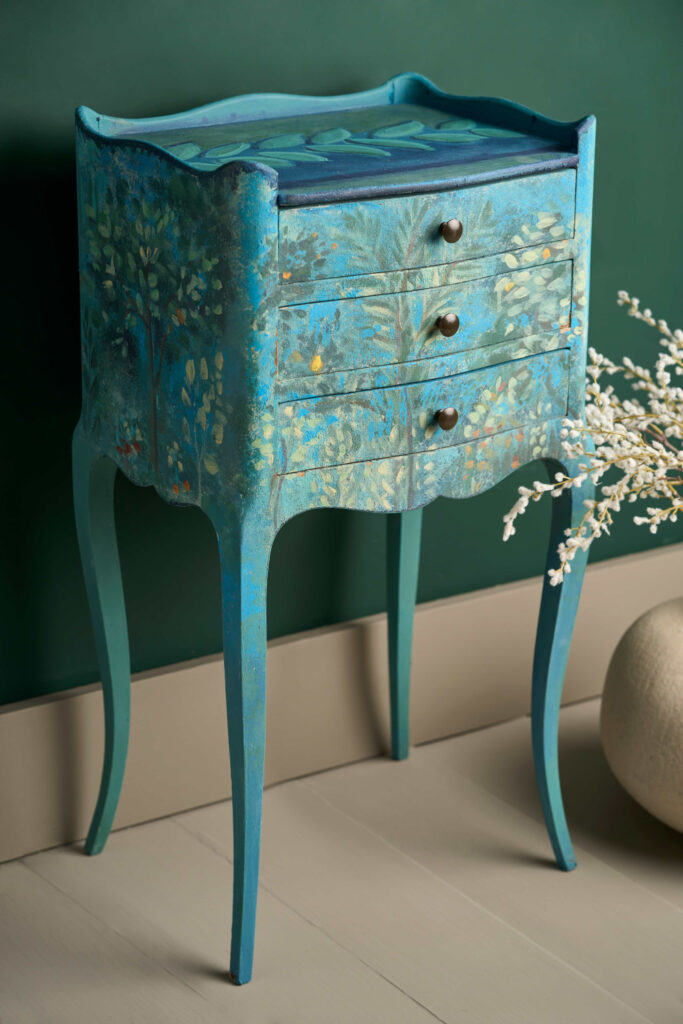
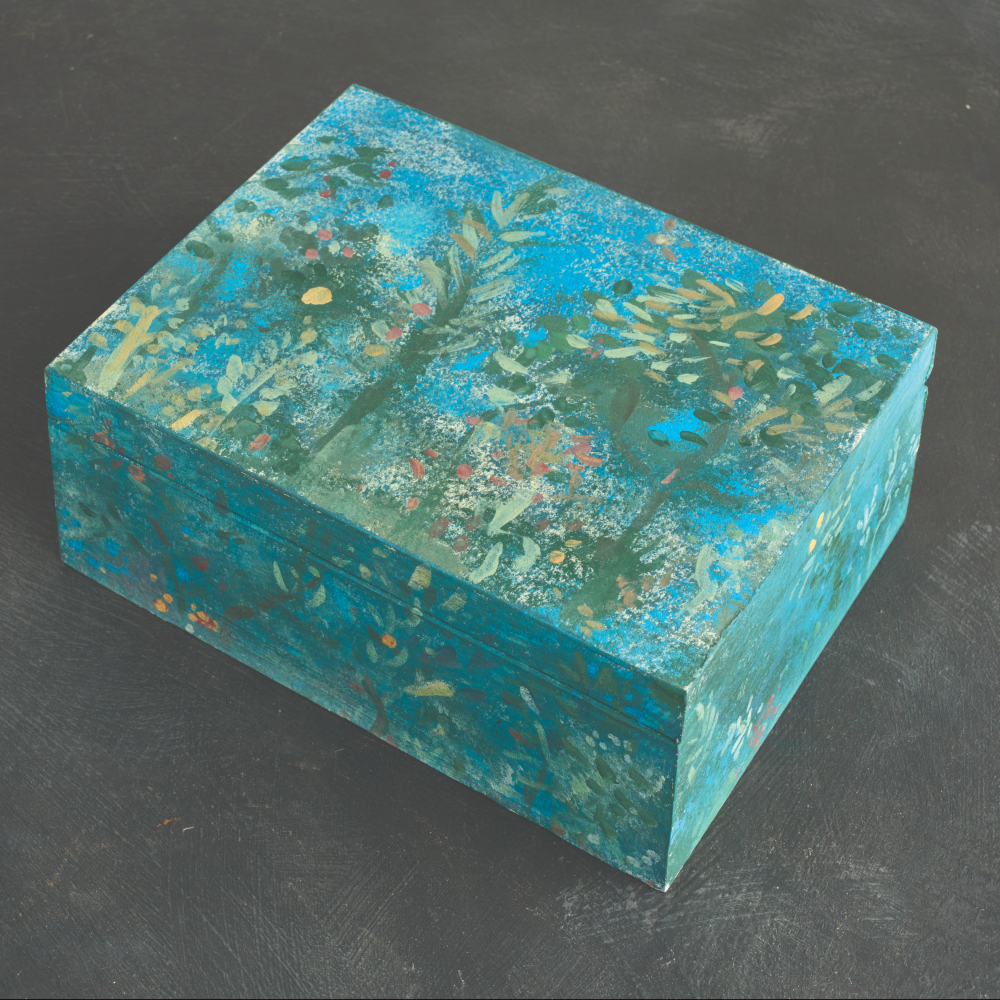
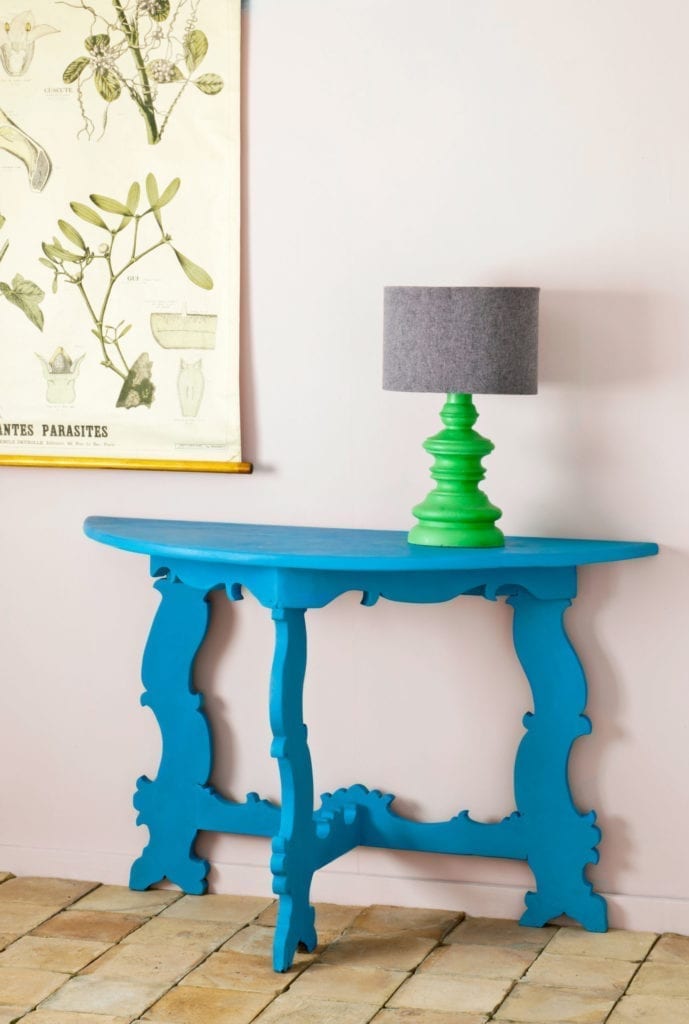
Frida Blue named after Frida Kahlo’s house in Mexico is a bright, joyful blue with a contemporary edge. It’s perfect for adding personality and vibrancy to smaller pieces or accent walls.
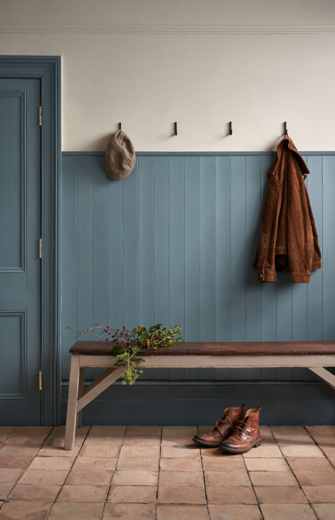
Cambrian Blue is a deep, slightly greyed blue that brings a sense of depth and sophistication. It pairs beautifully with warm neutrals and natural woods.

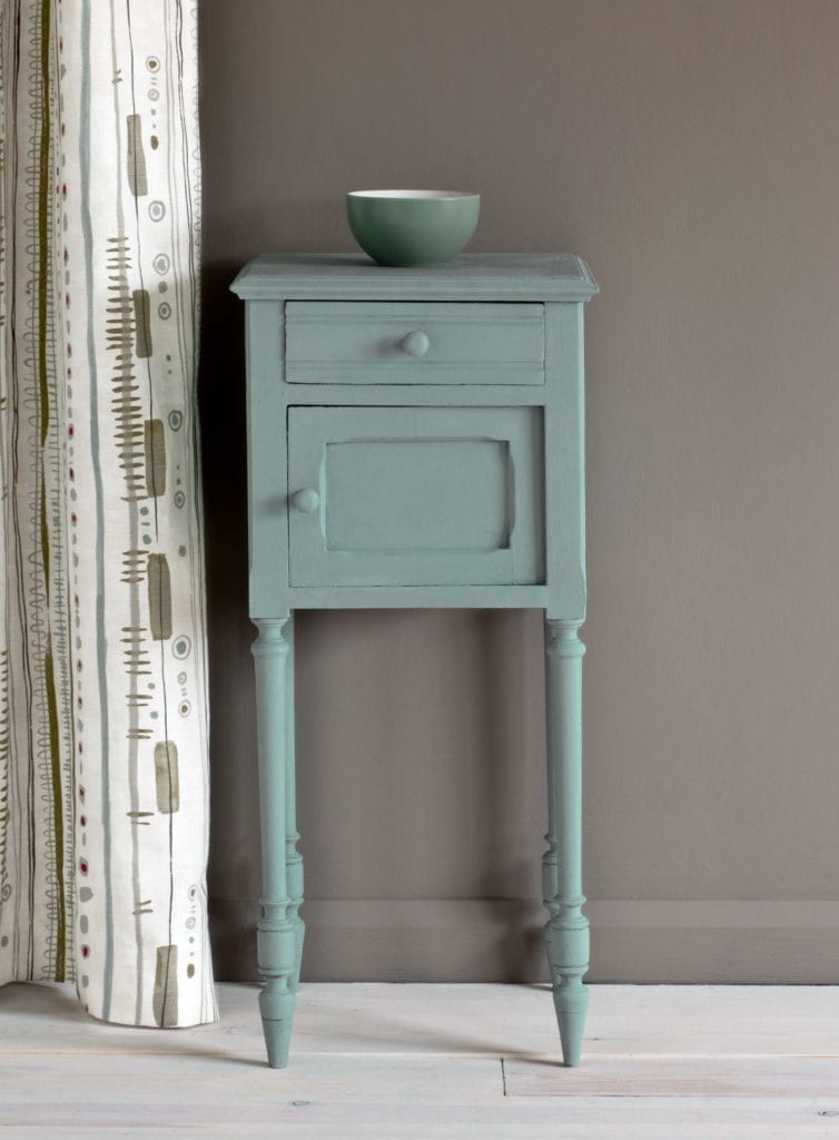
Upstate Blue evokes clear skies and open country landscapes. Its soft, gentle hue is ideal for creating serene, airy spaces that feel connected to nature.
How to Use Blue in Your Home
Blue pairs easily with many other colours.
With white, blue feels crisp and timeless.
With soft greys and taupes, it becomes sophisticated and calming.
With pinks, ochres or warm neutrals, blue looks lively and modern.
With golds and brass, it becomes rich and elegant.
Blue also has a wonderful way of making other colours shine. A blue chest in a room full of warm woods or creamy whites becomes a focal point without shouting.
Click to see how Annie creates the Faux Fresco Look
Blue Never Dates
While colours come and go, blue has been used in interiors for hundreds of years – from Delft tiles and French panelling to coastal cottages and grand country houses. Paint something blue and it will stand the test of time.
Whether you want your home to feel calm and restful or confident and expressive, there is always the perfect blue for you. 💙
Related Inspiration
Related Inspiration
Use of cookies
AnnieSloan.com uses cookies to improve your experience when you browse the site.