A Short History of Wedgwood – and the Colours That Made It Famous
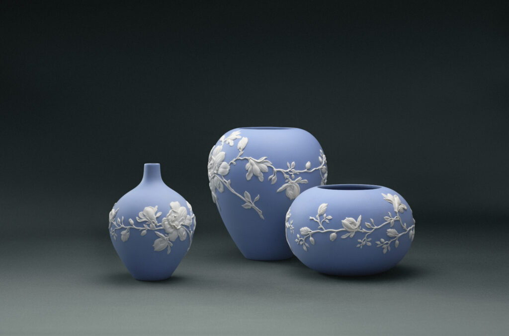
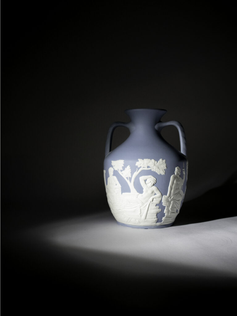
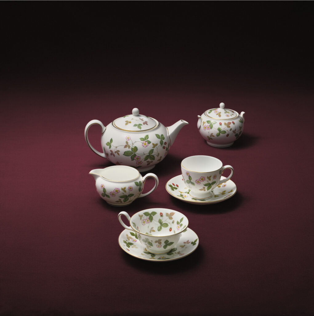
You’ve probably seen Wedgwood before – even if you didn’t realise it at the time. It’s a famous British ceramic brand best known for its decorative tableware – things like plates, cups, vases and ornamental pieces. It’s iconic soft blue background with white raised decoration has a way of popping up everywhere: in antique shops, at relatives’ houses, or tucked away in collections.
Wedgwood was founded in the 18th century by Josiah Wedgwood, an extraordinary figure of the Industrial Revolution. Born in 1730 in Stoke-on-Trent, the heart of England’s pottery industry, Wedgwood was not just a potter but a pioneering entrepreneur and creative thinker. He helped turn ceramics into something much more refined and design-led. He was also incredibly good at getting his work seen – sending pieces to influential people and building a recognisable style that quickly caught on.
Working during the height of the Neoclassical movement, Wedgwood drew inspiration from ancient Greece and Rome – an aesthetic revival driven by symmetry, order and classical beauty. This influence came from the “Grand Tour,” where wealthy young Europeans travelled through Italy and beyond, bringing back ideas, artefacts and a fascination with antiquity. Wedgwood translated these influences into ceramics adorned with classical figures, foliage and ornaments. His ceramics with their elegant shapes, repeated patterns and distinctive raised white details that feel almost like they’ve been gently placed on top quickly caught on.
Listen to The Colourist podcast’s newest episode on Wedgwood
It’s Not Just About the Blue
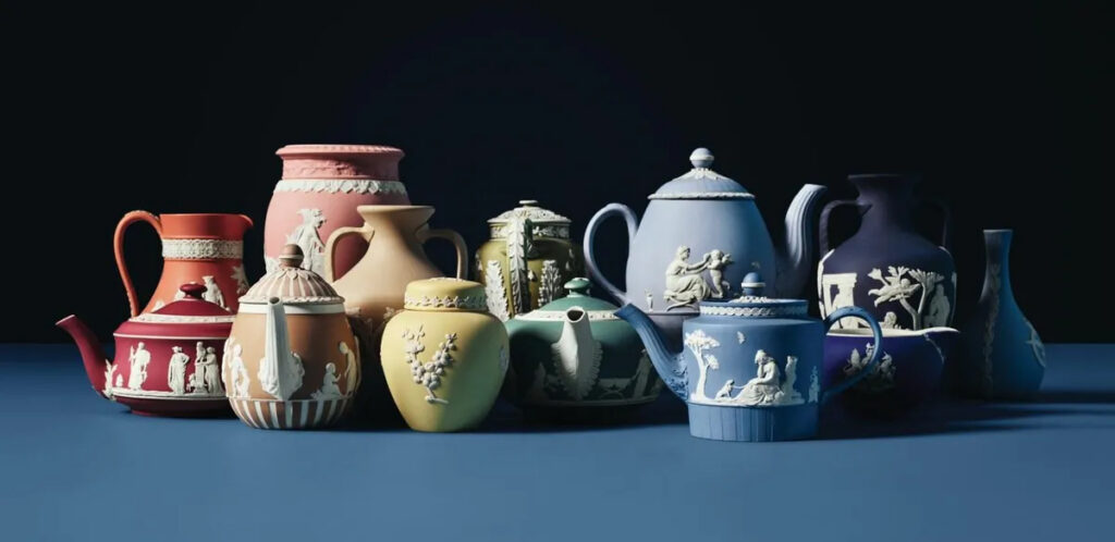
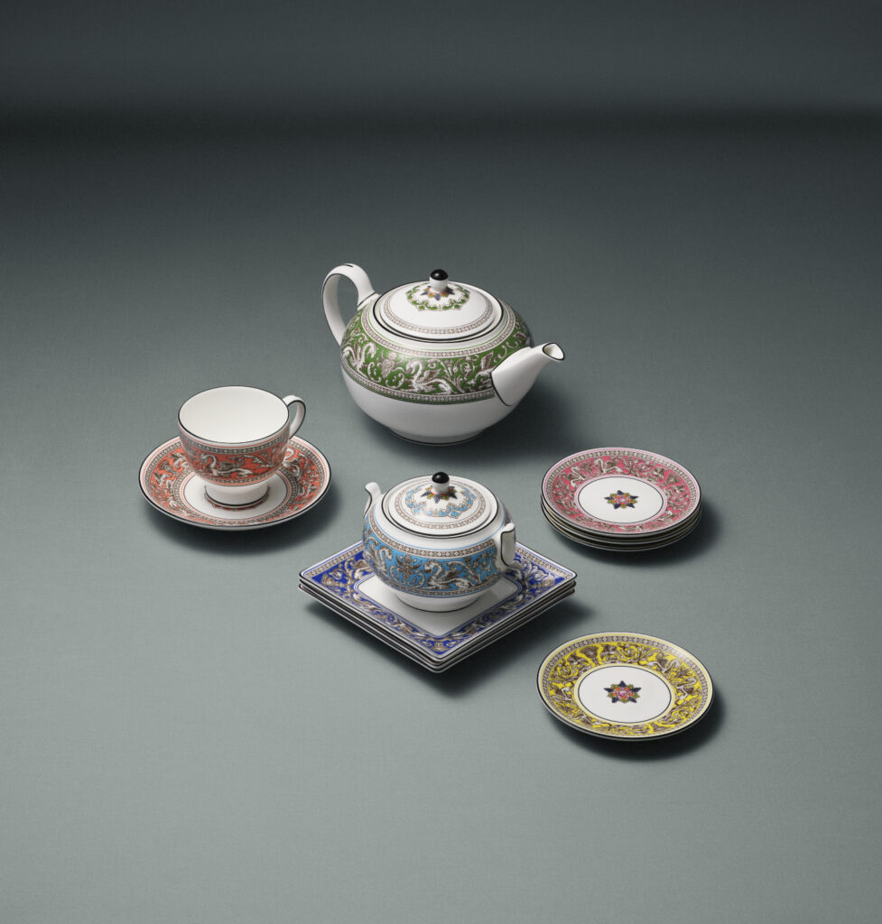
When we think of Wedgwood today, one colour immediately comes to mind: that unmistakable soft, pale blue. It has become synonymous with the brand – so much so that it’s often simply called “Wedgwood Blue.” But as Annie points out, Wedgwood actually used a whole range of colours.
This was because, like Annie, Wedgwood was obsessive about colour. He experimented constantly, creating lots of small test pieces and adjusting the colour again and again until it felt just right. That’s part of why the colours feel so considered – they weren’t rushed. Sound familiar?
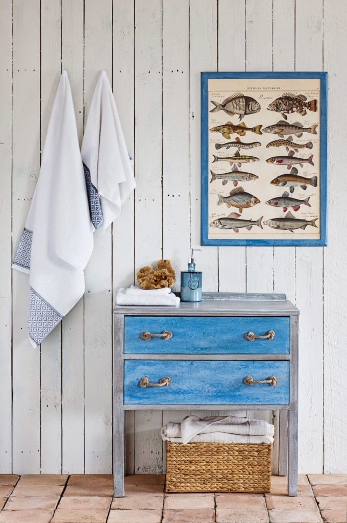
Alongside the well-known pale blue, there were deeper punchier blues, soft greens, warm whites, strong blacks, and even some really beautiful dusky pinks and rich reds. It wasn’t about bright, loud colour – it was about subtle, slightly muted tones that worked together.
Wedgwood isn’t really about one colour. It’s about a group of colours that sit beautifully alongside each other much like Annie’s Chalk Paints.
Bringing It Into Today’s Interior
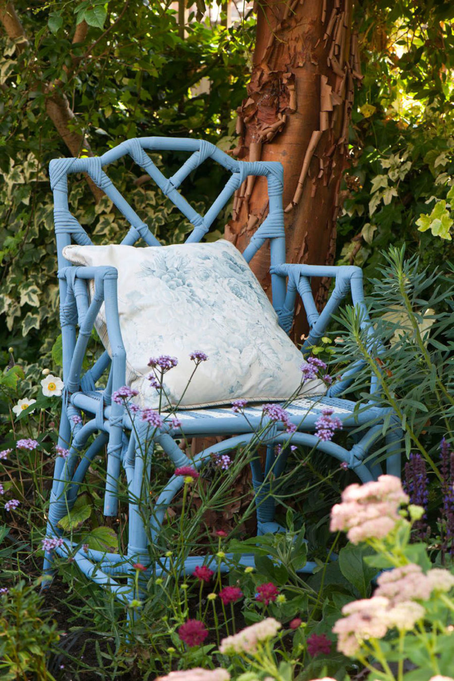
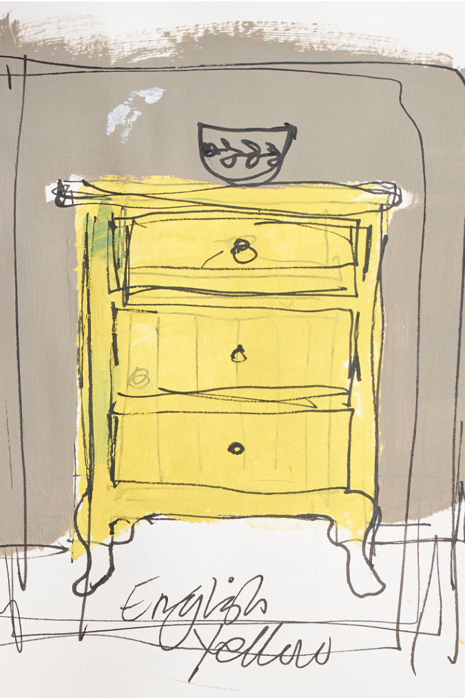
If you’re looking to recreate a bit of that Wedgwood feel, Annie has chosen Chalk Paint™ Greek Blue as the closest match to those classic tones.
Greek Blue has that same timeless quality – it’s soft but still strong enough to hold its own. It feels rooted in those historical colours, but it also works well in modern interiors.
And just like the original Wedgwood pieces, it works best when you don’t use it on its own. Try pairing it with soft whites, muted greens or even a gentle pink to get that layered look.
One of the most interesting things about Wedgwood is that it’s often remembered as being a bit “pretty” – but when you look closer, there’s a lot more going on. The colours are thoughtful, the combinations are clever, and the whole look is grounded in history and experimentation.
As Annie says, maybe it’s time to look at Wedgwood again.
 | English Bone China, Fine Gifts & Home Decor
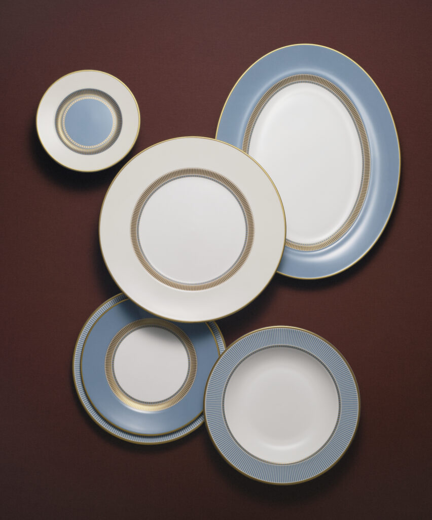
Related Inspiration
Related Inspiration
Use of cookies
AnnieSloan.com uses cookies to improve your experience when you browse the site.