I’m going to teach you how to do frottage!
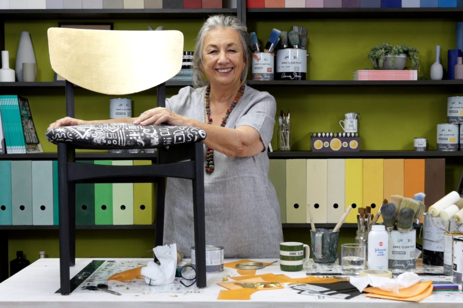
Techniques with Annie Sloan
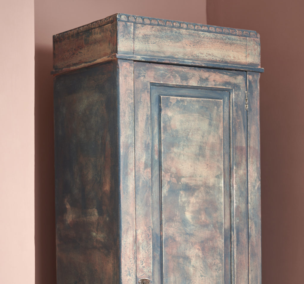
Create a rustic finish with frottage.
So what is frottage? Frottage is a french word meaning to rub and I actually think, I’m not entirely sure, that I invented this idea for furniture.
I’d looked at an artist called Max Ernst and he’d done these pieces. He was rubbing on and making pattern out of rubbing on three-dimensional surfaces and getting these quite rather lovely looks. And somehow, I don’t know how I did it, but I ended up doing this where I was rubbing newspaper over wet paint, and I called it frottage because it is to rub. So there was a…but it’s so long ago, I did it in my very first book. Or my second book called Nursery Style, and I did it for a mural because I was covering a large area.
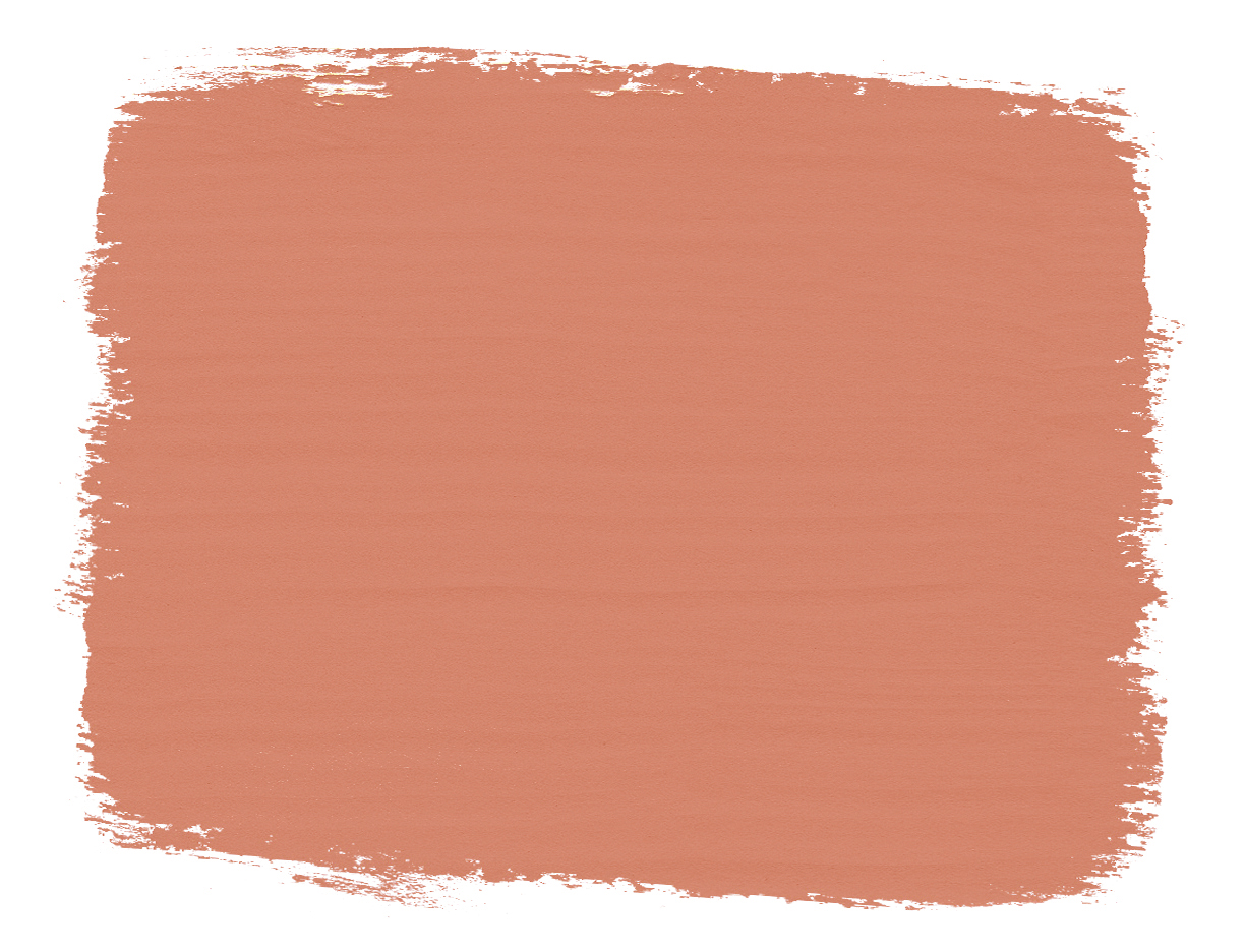
So that is how this has come about, this word and how I did it. I’m going to be um frottaging this piece of furniture. I think it’s really good because it’s a nice big flat area. I’m going to do it, I painted it already in Cream, and then I’m going to do a frottage of Scandinavian Pink over the frottage.
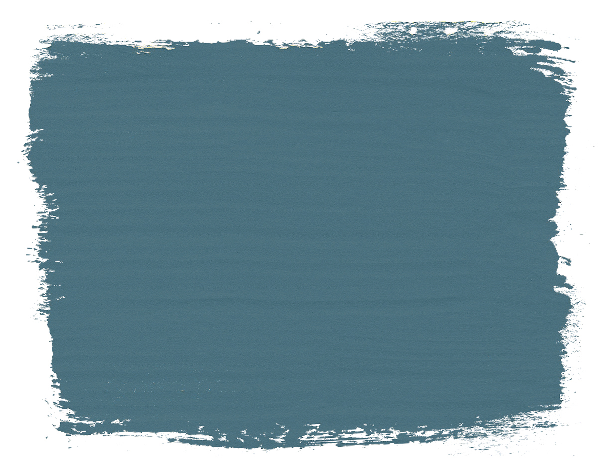
I’m doing these colours because this is copying a piece of furniture that I did many years ago. It was a table and the inspiration was a Swedish piece of furniture that I’d seen, a very old piece of Swedish furniture. And I loved it, I thought it was really gorgeous. I started with a pink and a yellow, or Scandinavian Pink and a Cream, and then I went “I don’t really quite like this, this is not working”, and so then I remembered this Swedish piece of furniture and then I did the Aubusson Blue on it. So there’s going to be three layers of this. And then I thought, this is fabulous.
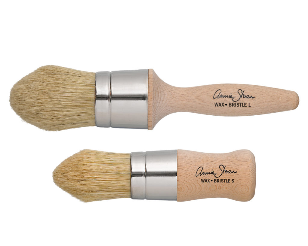
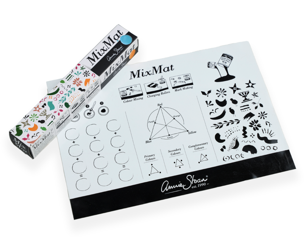
I did the first coat with Cream as I said, and now I’ve got Scandinavian Pink. For this, I will need, it’s really good to have one of these, this is a MixMat. It’s not essential it just makes it easy to mix and play. I’ve got some water, I’ve got Wax, and then the very important thing is I’ve got newspaper.
So what I’ve already done is I’ve done a little test at the side. Whenever I’m doing a piece of furniture I don’t tend to start at the front because everything is different. You might have done it on a piece of other piece of furniture and it’s worked beautifully, and on this one it’s not going to work, so I always test it out, so I’ve done something down the side here.
To start, I’m mixing some Scandinavian Pink and some water. Now how much water depends on so many things. It depends on how absorbent this is, and you have to test that.
And I’m going to put my glasses on now because I have to see what I’m doing!
I’m going to do sections. I’m going to do this bit first. So if I can see the background through there, I must have enough water in there to be able to see the Cream underneath. Now I’m going to take a new piece of newspaper, and I should be really quick with this but it’s not going to be very quick… Crumple it up and then open it out. So I’m not, some people think that I use this as a rag, like the old-fashioned ragging? I’m not, I’m doing this.
And then you need a flat surface. So either your, either your fist or the palm of your hand and then you’ve got this texture already. I can see I missed a bit up there and it’s a little bit darker there. Personally, I don’t mind that, I might go back in but there is going to be a third colour so that should be fine.
And now I’m going to continue so I’m happy with that. It’s just got to be thin enough, if it’s too thick you’re not going to get a technique and if it’s too watery it’s not going to look right. So now I’m going to go across, up on to there. You can always patch up little bits later.
Be quite generous with the way you apply, don’t worry about little bits that… Got some left over from there. Be careful that you don’t get finger marks. So if you do that, oh it didn’t come up, but it can do, you’ve got to be careful. You’ve got to be fairly quick. So that hasn’t done very much, just try doing that again. It might be a bit thin there but I think this is okay.
I’m adding paint and water together so that I feel that it’s the right consistency, that it’s thin enough and watery enough and so it won’t be too opaque, it must have that translucency. So, so paper in hand, brush in hand and I’m now going to do the next layer.
To avoid getting any lines here, I usually try to work wet into wet and if it’s not you can always sort of slightly fudge it. So I think that’s… we get away with that. The paper will only absorb so much paint so you’ll have to get a new piece. I think that’s all right, there’s a little bit of a line there but that will be fine because I’m going to do a second coat on there.
I’m going to go over this and I can always wipe that off later, otherwise you’ll spend too much time working around the door furniture. Really before you start, you should have lots of bits of paper ready. You don’t want to be stopping halfway through.
Now I’m doing it with newspaper, but there is something really interesting you can do. You can do it with fabric, so if you’ve got some old fabric you’re about to throw away you could try it with this, that could be really good.
Now, I just did it there and I did it with my fingers, and you can see marks. So that’s why I’m saying it’s better if you can do it with the flat of your hand. If you do do that, just want to show you can get rid of it. I’ll go over. So it’s a little bit thinner there so you can always go back into it.
Ok, so more paint. I’m probably using about 50:50, but don’t take that something you’re going to do because it might mean that actually you need less paint or more water whatever. Each piece of furniture absorbs paint in a different way, so some wood is incredibly absorbent.
And when you put this on, you’ll notice that I’m putting it on every which way, so some areas are going to be thicker and some areas thinner. Don’t worry about that, that is absolutely fine. As long as it’s, I suppose I’d say ‘evenly uneven’.
What’s lovely about the paper is because I’ve scrunched the paper up, you get uneven bits in it. That’s the whole purpose, you can do it flat but you’ll get a different look. I love it when you do this scrunched look. Because of that it doesn’t go completely flat you get lots of lovely texture.
So this bit here hasn’t got very much going on on it, because it’s recently put on, oh I’ve got some finger marks there. I’m just going to go over those again while it’s still relatively wet the paint. There.
I’m going to go around and have a look see what it looks like because I can’t quite see. Yeah, that looks great. I’m just going to do… so it’s good to stand away to see what it looks like.
There’s a little bit there that’s not terribly interesting. But it’s quite good because you want something that’s a little bit dynamic. I work fast, but don’t panic, because if you panic it’s all going to go wrong. Because you can actually start and then wipe it off and start again until you’ve got the hang of it.
This is actually quite a quick technique. And don’t worry too much, I’ve got a dot there, that might be quite good, and this is a little bit more textured – it’s all fine. So now I wait for that to dry, which, it’s a little bit wet in places.
And then I’m going to wax it, and then I’m going to put the Aubusson Blue on. But actually, you could just leave it like that, wax it, and that’ll be finished because it does look really lovely.
So I’m back, it’s all dry now, I’m ready to go. I’ll just say why it’s important that it must all be dry, because if there is a little bit of pink that is still wet, when you start waxing it that will lift off and you’ll get something completely, well sometimes it’s fantastic. But quite often it’s not, it just looks like you didn’t paint it…
So I’ve got my wax and got my brush, and I’m going to get a nice bit of wax onto there and I’m just going to wax quickly all over. The reason I’m waxing is because if I start painting onto here with wet, watery paint it’s going to lift some of this pink off, and you don’t want that to happen. I want this pink to stay and I want all those marks to stay. So waxing it quickly is just fantastic.
This is actually quite a good time to tell you about waxing just briefly, people can get a little bit precious about waxing. You see how I’m doing it, I’m just every which way and all over and quickly.
It won’t matter if some bits are…I’m not missing any bits actually, I’m just being quite systematic, and making certain it covers everywhere. So I’m not going to wipe it, as long as it’s not really thick in places that should be absolutely fine, just sort of feel it, it feels good. And what you’re just doing is creating a seal.
So, next step: Aubusson Blue, water and a brush, same thing. Paint onto there, and then making certain it’s nice and translucent, but not too translucent otherwise it’s not going to have the required look. I think I want it to look quite Aubusson Blue, so not too much of the pink shows through.
I’ve got all these ready, last time I used four sheets and this time, I’ve just made five just in case. I’ve crinkled them all up and I’m ready to go, very exciting.
This is good because I can see the pink underneath, it’s not covering completely but it’s covering quite well. Yes! I love it, really nice. It’s a little bit heavier down at the bottom there. I quite like that but not perhaps too much, that’s just lightened it a little bit more. Yeah, exciting! I hope other people like it as much as I do, I think that looks really good.
So more paint now. I’ve only used some of that paper so I can reuse that paper again. I think it just, oh where did that go? Here it is here. So I’ve only wet/dirtied some parts of it, so I can do that side and that side. As I say, it absorbs the paint and it will get wet it won’t work so well.
So, actually I think I’m going to put that one to the side and I can use bits of it, but now I’m going to go on to here.
Oh gosh that’s looking gorgeous, I quite like that in there actually. Now that’s given me an idea, I think I won’t do much frottaging in this area here, because I think that’s given it a, a little bit of depth.
You can’t hang around too much, not too much thinking and worrying just getting getting on with it. Thinking is overrated, if you think too much you won’t get on with it and then you’ll worry about it and then it’ll all be over and it’ll be too dry, so got to get on with it. A bit more paint…
You’ll notice I’ve done this in more or less the shape of the, or the size of the newspaper. Oh that’s gone very big, I probably used too much water. So what’s great is don’t panic, it’s fine, I’ll just go back into there. It’s still showing quite big so I’m going to go back into that with a slightly more heavy paint. It would be right in the middle wouldn’t it! That’s what happens sometimes.
What I’m going to do is I’m going to put it on and leave it there for a little bit, so that it’s not coming off so quickly. On this bit here I’ve probably done it too many times, or I didn’t have enough wax on it, so some of it has come through. So this is things that go wrong, and it’s quite good. I’m quite happy to show you where these things go wrong. But because it has gone wrong there it’s taking off too much.
What I’m going to try to do is just make that bit a little bit darker, so I’ve put more paint on there, less water, and just build it up a bit. So what’s happening every time is you’re getting quite a lot coming off. What I think I’m going to do is I’m going to leave it and go back into it a little bit later, so although it’s quite strong and dark there, I think it might be okay.
I need to have it darker, oh it’s working, oh I don’t like that. So I think what’s happened is some of the pink has come off, so it’s getting too light. But I could try putting some back onto there. I think it’s fine anyway.
The one thing you have to do is always step back and not worry too much because I think you over… you start getting involved in one tiny area and actually you need to step back and look at it and actually, that’s fine. You see it, you know what happened, no one else will. And so I’m going to see if it works, it might not and if it doesn’t, I might just redo that panel which won’t take that long.
But basically that’s it, I will wax over that again when it’s all completely dry and then that’s it it’s all finished, and I think, I hope you will like it, I think it’s fantastic.
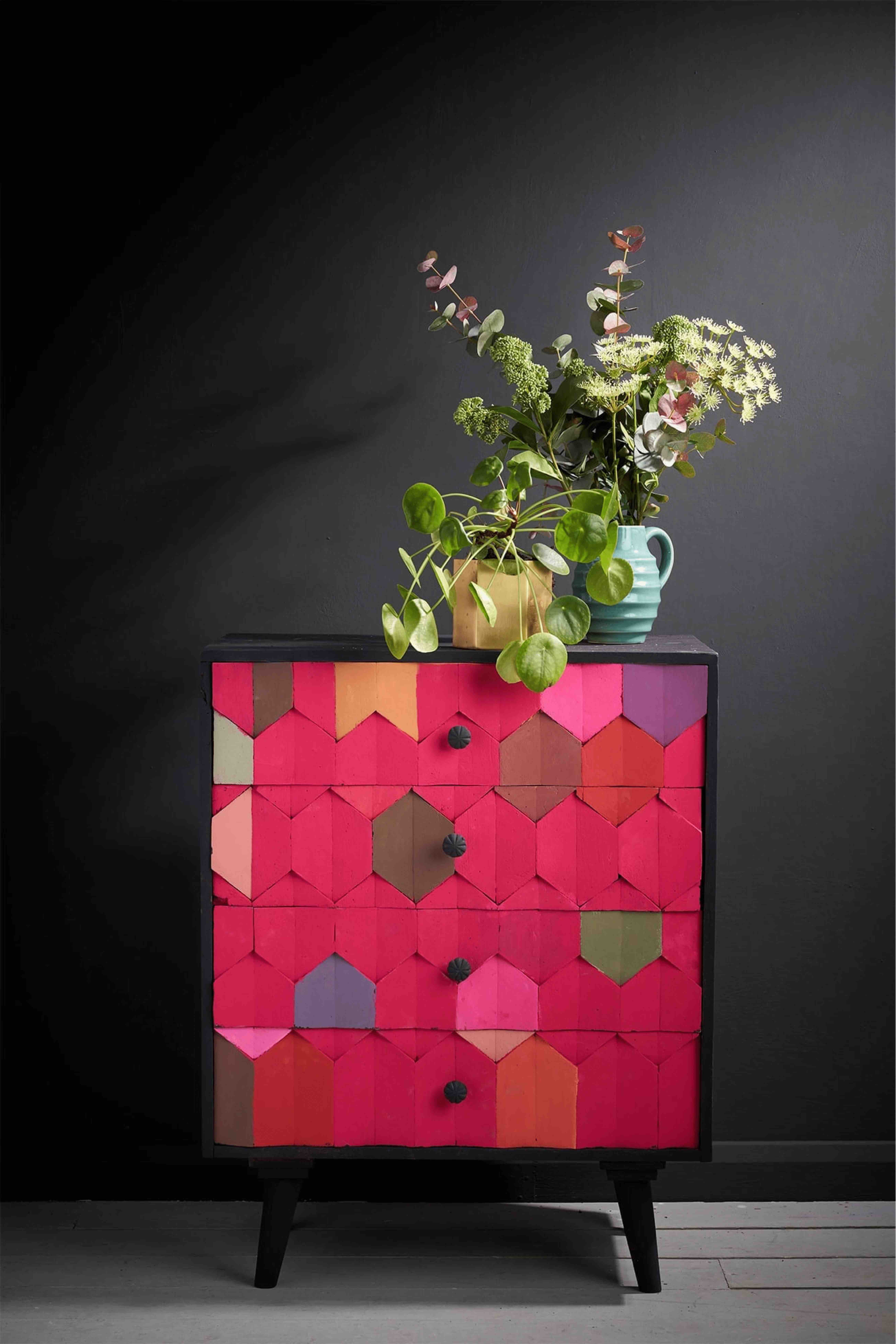
So I’ve done some other things which I really love. My favourite one is this box which I think is really lovely. I did it with Graphite, that was my first coat, and then over it all it is, and it looks like marble doesn’t it, it is so… I just love it. And I did over Paris Grey. I thought I wanted a sort of like black-white marble, but if you put white on it it’s just like – too contrasty. So yeah I think it looks fantastic because it’s like marble and so simple to do.
And I did the opposite, it’s a little more subtle but it is really lovely. And that was Old White with again Paris Grey over it but it does look really good and like it’s a sort of white marble. I could have done it… I think it needs a bit more contrast to it, but the great thing is that even now, I did this probably about a year or two ago, I could redo it and just put another bit of black over it or grey or whatever, dark grey I could mix. So there’s those there.
And those I love, this is probably one of my most favourites. So this is in one of my books, it’s in Paints Everything. I was experimenting a little, so I painted it with Paris Grey, then I put Greek Blue, and then I finished it with Napoleonic Blue.
And I did the frottage, and at some point I did a lino cut on it. Here is the lino cut, and it was the stupidest thing! I was just going to experiment to see if it worked, and it is actually a cup of tea in a sort of flowery teacup. And I just wanted to see if it worked and I did it and I went “oh my goodness!” because you would never think that that is a flower tea cup. But it sort of works very well, we’ve got this slightly off-beat, off-centre oval and this circle it just looks really… I like it anyway.
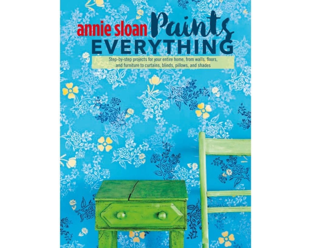
Also in this book is another one which is very very different. It’s English Yellow with Provence on it and it does look, well it goes very green which is amazing. And it’s quite out there and crazy, and I did this one recently too.
This is very strong again but you know, it’s where you’re doing it and how you want it to look. This could look amazing against a very dark wall. So this was Emperor’s Silk with I think it was Napoleonic Blue over it and, it’s very very strong. But wow, quite an impact ey?
So it’s all about colour, it’s all about colour. The technique itself is really quite simple, but it’s all about colour how you make that colour work. So I hope this has inspired you to do more frottage!